Commissioning your logo and brand identity: A guide for small business owners - Part 1
- Alicia Cheah
- Aug 19, 2024
- 7 min read

Updated: Aug 21, 2024

It’s tough to put an exact dollar amount on the value of a logo, but when we think about the most iconic designs – from the Nike Swoosh to Apple’s “bitten apple”, to Coca-Cola’s cursive script, we instinctively recognise that they hold tremendous value.
A good logo and brand identity is an incredible business asset. It creates a lasting first impression and concisely tells your brand story. There’s no substitute for getting your product-market-fit right, but a professional and cohesive identity elevates your brand and signals to the market that you’re a serious business.
If you’re a small business owner or an early-stage startup founder, you’re most probably not going to have a creative director or brand strategist on staff to handle the commissioning, briefing and feedback process for your business’s brand identity – that task is likely to fall on you.
Navigating the design process (as a non-designer)
So how do you go about this process to get the most effective outcomes for your business, especially if you don’t have a design background and don’t speak the lingo?
The formula is very simple (in theory).
Better communication = better outcomes.
Design is an inherently collaborative process, so good feedback can make all the difference between a project with a great outcome versus a frustrating project that’s blown out in timeline and cost, with more cycles of revisions than a merry-go-round.
As a non-designer who has worked with creatives for my entire career, here’s my guide to commissioning, briefing and providing feedback for your brand identity to get an outcome you love. I’m all about the idea of authenticity and building in the open, so will be using my own logo and brand identity, Digital Sublime, as a case study.
I’ve broken this article into two parts. This article covers part 1, which is all about selecting a design partner and briefing them on your requirements. Part 2 will cover how to provide feedback during the revision stages until an outcome is reached.
Basic design terminology
Before we start, here’s a quick rundown of some definitions.
Logo: A visual symbol that represents your business. There are a few different types, such as monograms (lettermarks), text-only logos (known as wordmarks), or something that consists of a picture (logomark). Most brands use a combination (wordmark + logomark).
Brand identity: All the visual elements that represent your business. This would include your logo, but also brand colours, typography, iconography and so on. The overall style drives a cohesive look and feel that communicates the brand’s values and positioning. Ahm, for example, has a monochromatic colour palette and uses sketchy, hand-drawn illustrations to convey that they are a no-frills, value-for-money health insurance brand.
Typeface: A typeface is the design of the letters and characters used in your branding. It’s what people often call “fonts,” like Arial, Times New Roman, Helvetica, and so on. (Fonts technically refer to variations within a typeface - e.g. italics, roman, bold, but people use ‘fonts’ and ‘typefaces’ pretty interchangeably.)
Background
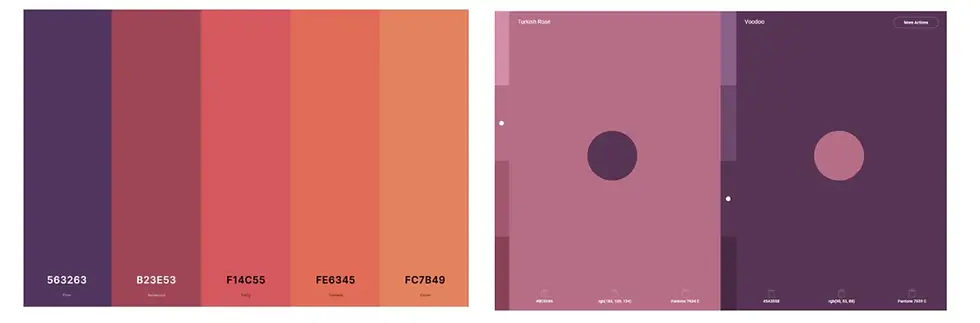
In April 2023, soon after my redundancy from my corporate role, I had some freelance work unexpectedly land. I needed a logo quickly that I could put on proposals, statements of work and invoices, so I used an AI logo generator to turn something around in less than an hour. This was the result.
Honestly? It’s OK. It did the job at the time, and was sufficient for 12 months or so. I still think it’s fine for what it is.
But after I decided to go all-in with my business, I wanted something more polished and professional. I got tired of the cursive script, which had legibility issues at smaller sizes, and found the maroon colour too dominant and dour. I wanted something fresher, lighter and more vibrant. And while AI logo generators can do some pretty cool things these days, I wanted to work with a human designer.
The commissioning process
Know your own business
Before even thinking about commissioning a logo, you need to have a clear vision of your business, such as:
Your goals for the logo/brand identity project: Is it a brand new business or an existing one? Are you looking to launch an app or to start pitching to investors? This is all helpful context for your designer.
Your business name.
What your business does: What are your core products and services? What industry are you in?
Your ideal customer: Who are your customers? Consider demographics (age, gender, geographical location, educational background, income), but also psychographic traits: are your customers working adults who care about their fitness? Politically active youth? Environmentally conscious fashion lovers? Time-poor business owners?
Your brand positioning: How is your business positioned in the market? What unique niche does it fill?
An example of fabulous brand positioning is Hnry, a tax and accounting app. They’re not targeting large enterprises with big accounting teams, or even 100-person companies with dedicated bookkeepers. They serve sole traders - the photographers, physios and plumbers who don’t have a ton of time to spend on accounting and need to focus the bulk of their time and energy on their core business, with the promise that they’ll be freed up to “never think about tax again”.
Your brand values: What are the guiding principles for your business? A few examples: LEGO’s brand values are: imagination, fun, creativity, caring, learning and quality; while one of The Guardian’s most striking values that highlights its commitment to journalistic integrity is “We stand up for what we believe is right, not what is easy”.
Your brand personality: What are the traits your brand would have if it was a person? Is your brand playful and irreverent? Wholesome and down-to-earth? Intellectual and serious? Luxurious and indulgent? Rugged and rebellious?
Choosing the right design partner
Aesthetics
Invest a bit of time looking through different portfolios to find a designer whose aesthetic sensibilities match what you envision for your business. If you're set on a particular type of logo or you are passionate about a particular aesthetic (e.g. retro, 8-bit, luxury), look for a specialist in that style.
Otherwise, if you are open to new styles, try a designer with a diverse portfolio and a high degree of versatility. It can be helpful to keep an inspiration board of logos, colour palettes, and typefaces that you like.
For my business, I wanted something clean and minimalist, with fresh and modern lines and a vibrant colour palette.
Budget, time zones, language and other criteria
You’ll also have considerations beyond style and aesthetics. What is your available budget for your project? Are you able to work with someone in a different time zone? How critical is it for them to be fluent in your primary language? I used Upwork to source my designer. To make it easier to shortlist, I set the following parameters:
Upwork Top Rated or Top Rated Plus status
Minimum 95% job success rate
Minimum 50K+ earnings on the platform
Maximum USD$60/hour rate
In the end, I went with Cosa Nostra, a design agency in Poland. It helped that they had done work for other clients in similar industries, but more importantly, I loved their style, use of colour and clever use of typography, such as the ‘H’ in the Houndr example, the negative space ‘explosion’ in the Dynameat example, and the skyline element in the Bilt example.

The creative brief
Once you’ve selected your design partner, the next step is to provide a creative brief. This outlines essential information about your business, project goals and target audience, giving your design what they need to create an identity that captures the essence of your brand.
Most designers or agencies will have a template to capture the information, but as the business owner, only you can articulate your brand’s vision, mission and core values.

While you know your business best, it can be challenging to step back and see it objectively. That’s where my Brand Strategy Tune-up workshop comes in. Through practical exercises, I’ll support you in clarifying your brand’s vision, mission, values, offerings, unique value proposition, personality, and tone of voice, laying the groundwork to make commissioning your logo and brand identity a breeze.
Business background
As per this list.
Project requirements
The creative brief should outline other important project requirements such as:
Timeline: When do you need the logo and brand assets?
File formats: Always ask for source files and vector versions of the logo (.ai, .eps, .svg or .pdf file formats). If you only have JPEGs or PNGs, you’re very limited in what you can do, particularly if you want your logo printed or animated down the track.
Logo usage: Will the logo be used digitally (website, social media, emails), in print (business cards, banners, signage), or both? This is helpful for designers to keep their colour selections in mind, as the CMYK colour spectrum (used in print design) is limited compared to the RGB colour spectrum (used in digital design), so knowing this helps your designer pick colours that look great wherever your logo is used.
Logo variations: Do you need monochrome versions, stacked versions for your social media profiles, or an icon-only version for app icons or favicons? Let your designer know what versions you’ll need.
Visual aids and inspiration
It’s helpful to share examples of logos and brands you like with your designer to convey your preferences. I let my designer know that I wanted to avoid overly corporate designs with dull colours like dark reds, greys, and blacks, as well as emblem and signature-style logos that don’t scale well for digital use. I preferred flat logos with elements of transformation and the use of negative space. I also expressed a preference for warm, sunset colour palettes that feel organic and creative, and convey a sense of change and transformation.
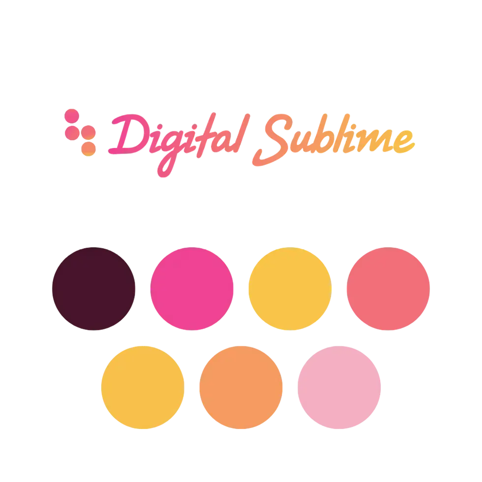
Case study: Digital Sublime logo and brand identity brief
Below is a summary of the creative brief I submitted to my designer.
Goals: Rebrand with a new logo and brand identity kit
Requirements: Full-color logo with versions for light and dark backgrounds, an icon-only version for social media, and a brand identity kit with fonts and colour palette recommendations.
Business name: Digital Sublime
Service offerings: Strategic advisory and execution for organic content and community marketing programs.
Brand vision: To create authentic, high-quality content and community experiences that build trust and nurture organic growth for businesses.
Target audience: Startups, solopreneurs, and small-medium businesses in professional and technical fields. Based primarily in Australia.
Brand positioning/unique selling points: Background in education publishing. Experienced working with subject matter experts to create accessible and valuable content for audiences that are skeptical of sales messaging.
Brand values: Education, authenticity, craftsmanship and collaboration
Brand personality: A combination of the creator, sage and magician archetypes. Intelligent and articulate while remaining warm, personal and approachable.
Logo style: Combination mark (icon + wordmark) with simple, clean lines.
Key concepts: Transformation, growth, and creativity. The name references the philosophical concept of blending the technical and human sides of technology.
Preferred colour palette: Sunset colours that convey warmth and creativity, avoiding greens, browns, metallics, and dull tones.
What did my designer come back with, and how did the feedback and revision process unfold? Read part 2 to find out.

Comments